大前端时代的技术栈
html5
- 语义化标签(header、footer)
- 音视频处理(audio、video代替flash)
- canvas/webGL
- history API (browser路由)
- requestAnimationFrame
- websocket/socket-io实时通信
css3
- 常规
- 动画
- 盒子模型
- 响应式布局
- ...
JS
底层原理
- 堆栈内存
网络通信层面
- 前后端分离(fetch、axios)
- 性能优化方案
- 代码优化
- 网络通信优化(DNS缓存、强缓存)
框架
- react
- react-native
- vue
- uniapp
工程化
- webpack
- git
- linux/nginx
全栈
- node
- express
- koa
什么叫标签语义化?
合适的标签干合适的事情。
标签有哪些类别?
- 块状block
- 行内标签inline
- 行内块状标签inline-block
盒子水平居中垂直居中怎样实现?
这种需求在我之前的项目中十分常见,随着flex兴起,,后来看blog发现这种方式也十分好
//1、定位
body{
  position:relative
}
.box{
    width:100px;
    height:100px;
  position:absolute;
  top:50%;
  left:50%;
  margin-left:-50px;
  margin-right:-50%;
}

.box{
  translateX:-50%;
  translateY:-50%;
}

//2、flex
body{
  display:flex;
  justify-content:center;
  align-item:center
}

//table本身控制文本;要求父级有固定宽高
body{
    width:500px;
    height:500px;
  display:table-ceil;
  vertical-align:center;
  text-align:center;ß
}
.box{
  display:inline-block;
}

//JS
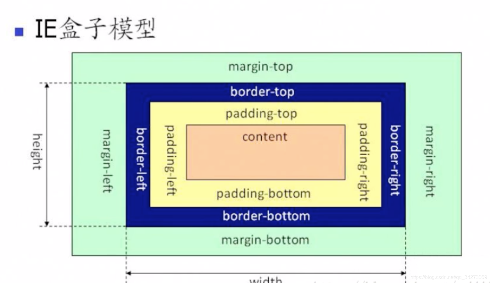
盒模型?
标准盒模型
- width/height + padding + border + margin
- content-box
- border-box
怪异盒模块(IE盒模型)
- box-sizing:border-box //盒子大小包括border
flex弹性伸缩盒模型
- 主轴
- 交叉轴
多列布局盒模型(columns,基本不用)
几大经典布局方案
圣杯布局(浮动和负margin)
- 一个容器中包含了左中右
- 双飞翼布局
- 中间和左右可以拆分
移动端响应式布局三大方案
- media媒体查询(PC移动端使用一套代码)
- rem(移动端)
- flex
- vh/vw百分比布局
请说明z-index原理
-文档流- 浮动
- 定位
- transform
- css3中的动画
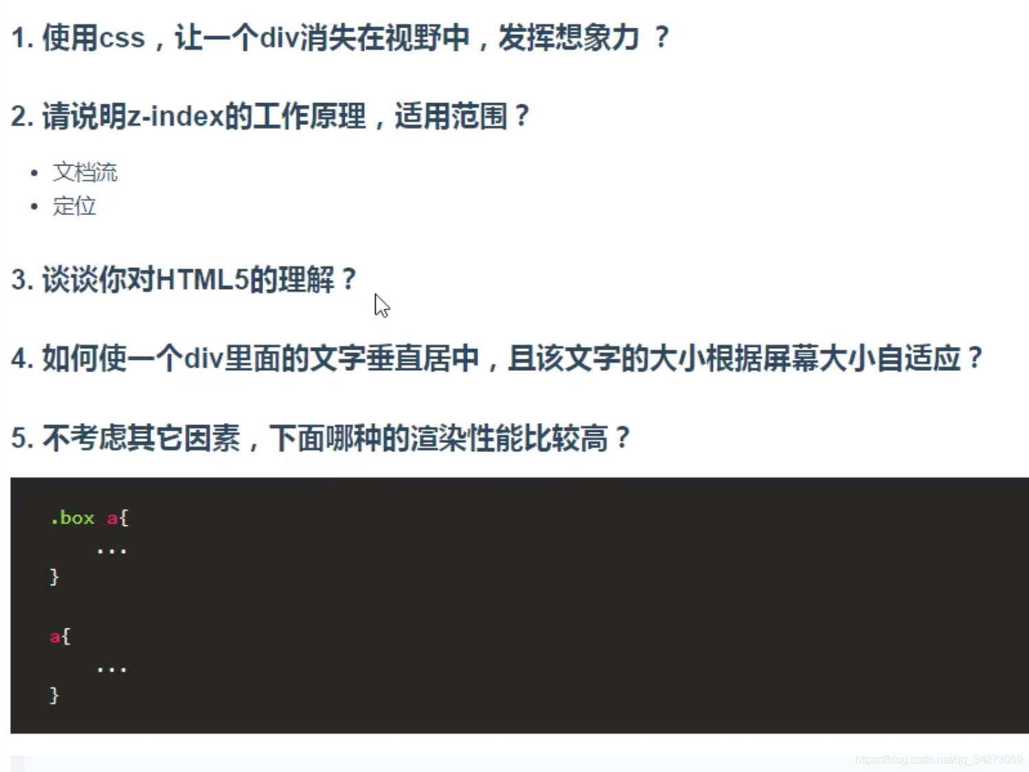
不考虑其他因素,下面哪种渲染性能比较高?
第二种,因为浏览器的渲染机制是从右到左查询
//1,先到a,再到box a
.box a{

}
//2
a{

}